
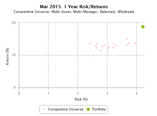
The Risk/ Return shows the risk and return of a product, benchmark or portfolio compared to a specified universe over a specified period.
What does the chart show?
The risk/ return chart plots the product, benchmark or portfolio’s return against its risk over a specified period. Other products in the specified universe are also included on the plot. Each investment is represented by a unique marker. Other products in the peer group are represented by a single pink dot.
How to interpret the chart
Products in the top left hand corner have a high level of total returns for a lower level of absolute risks.
When to use the chart
This chart is useful in showing the risk and return of a product, benchmark or portfolio relative to other peers in the universe.
iRate specific
An appropriate universe should be selected to compare similar products.
For portfolios/ diversified funds, we recommend selecting a universe with a similar risk profile.
Comments